ひと文字に宿る先人達の想いと、独自の書体を目指して
詩文を下書きする時に、文字の部分は既成の書体を参考にして描いています。
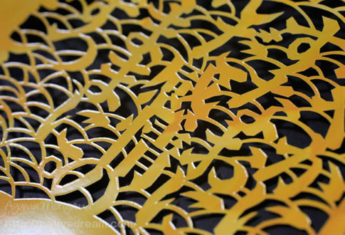
しかし、実際に切る時に文字の形に変化をつけています。
切り絵は基本的に全ての部品が、線や面でくっついていないと成り立ちません。
だから既成の書体では無理があることと、言魂切り絵独特の書体を完成させたいという想いがあります。
以前は、筆で筆跡に強弱をつけた書体を試した事もありました。
しかしその文字を切った結果、ほとんど認識できないぐらい意味不明な文字になってしまいました。
その時の経験から、整った既成の書体を基にして、切る段階で独特の「切り絵の味」をつけながら変化をつけていく方が文字として認識できて、さらに面白いものができあがることを知りました。
また文字を切っている時は、自然と文字の意味や成り立ちをイメージしてしまいます。
先人達が作り上げてきた大切な記号としての文字。
どれだけの想いが、その一文字に込められているのか?
それだけでも壮大なイメージが、広がってきます。
When you draft a poetry, part of the characters are not drawn to refer to the off-the-shelf typeface.
However, we have put in a change in the form of characters when actually cut.
Cutout basically all parts, not true and not stuck with a line or a surface.
So and that there is unreasonable in the off-the-shelf typeface, there is a feeling that you want to complete the word soul cut picture distinctive typeface.
By the well-equipped off-the-shelf typeface based on, those who go with the change while wearing a “taste of cutout” unique and at the stage cut is be recognized as a character, will create an even more interesting.
Also when you are off to a character, it will the image of the meaning and origins of the nature and character.
Character as important symbols that earlier people has been created.
How much thought is, what has been put in the letter?
Spectacular image even it only will have spread.